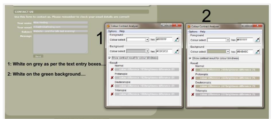
Reading some websites CAN be VERY tricky when “trendy” design is to have a poor distinction between text and background – don’t fall into this trap and have people leaving your pages because they just can’t READ them! Some photographers can also be “guilty” of this!!
An example that I did on another site I was sent to.
Try using this Colour Analyser tool to make reading easier!

Mac Version Available Here
For more full details on these neat little tools click the link here to Vision Australia


Comments
Colour Analyser — No Comments
HTML tags allowed in your comment: <a href="" title=""> <abbr title=""> <acronym title=""> <b> <blockquote cite=""> <cite> <code> <del datetime=""> <em> <i> <q cite=""> <s> <strike> <strong>